“t-h-i-s-space-i-s-space-space-space-space-space-space”: in Conversation with Giles Turnbull
-In conversation with Claire Trévien–
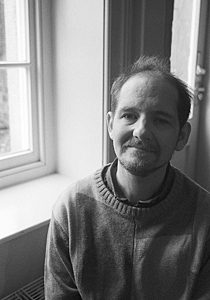
Giles L. Turnbull is a blind poet. He spent the first half of his life in North Yorkshire before moving to South Wales to study chemistry at Swansea University. He has lived in South Wales ever since, apart from a 5-year sojourn Stateside and two years in London. He has been writing poetry since his late teens. His debut pamphlet, Dressing Up, was published by Cinnamon Press in 2017.
In your Poetry Wales article you stated that to you ‘no poetry is visual poetry’ – can you tell us a bit more about that?
I had been sighted for 31 years before my sight first began to encounter problems from diabetes. I lost the sight in my left eye first, leaving me with no depth perception but no other significant problem. By 2007 my right eye had also begun to fail and in 2009 I registered as legally blind, making it 9 years this year since I stopped being able to read printed words on a page. Nowadays I use screen reading software on my computer to read any on-screen text aloud for me, including emails, Facebook posts and tweets, as well as novels and poems in Word or PDF format.
If a poem is specifically presented on the page to reflect a particular shape, or a desired spacing between words, then I do not hear that when the screen reader reads the poem to me. As far as a screen reading program is concerned a fully justified line of text sounds exactly the same as a left or right aligned line of text, or with six spaces between the first and second word, 10 spaces between the second and third word and 20 spaces between the third and fourth word. Whatever the poet intended by spacing his or her line that way does not get transmitted to me.
If somebody commented and said that they loved the layout of the poem then I would be intrigued to know how it had been laid out. I would go back and read each line character by character, which might be something like this: ‘This is the end.’ and my screen reader would say “t-h-i-s-space-i-s-space-space-space-space-space-space-t-h-e-space-space-space-space-space-space-space-space-e-n-d-dot” As you can probably tell, that does not generally transmit a very visual image into either a blind or a sighted reader’s brain. If a poem was laid out in the shape of a teapot, a screen reader is simply going to read it as if it were a sentence in a page of Oliver Twist.
A poem by Nuala Watt, herself a visually impaired poet, in her pamphlet ‘Dialogue on the Dark’ uses the format of an optician’s eye test for one of the poems. Sighted editor Nell Nelson of HappenStance Press alerted me when I reviewed Nuala’s pamphlet for the Sphinx website, telling me ‘the Eye Chart’ is set out like an optician’s reading test, with the first few words being in huge letters and then descending down the page until the very bottom is tiny’. To a screen reading program it could have been all in 4pt font or 44pt font —it will deliver it sounding exactly the same to a blind listener.
What I was niggled by in my Poetry Wales article was that The Poetry School had a course about visual poetry, and their information for it stated that ‘All poetry is visual poetry,’ and I considered they were incorrectly assuming that all readers of poetry are sighted.
Are there elements beyond the words on the PDF or read out loud that you think can contribute to your reading experience of poetry that you wish more publishers/authors did?
I am very keen to encourage publishers to put a short caption in the introductory pages to a book or pamphlet, describing what the cover shows. As a visually impaired reader I still would like to know what is shown on the cover, and if it is a plain cover I would like to know what colour it is and what text is on it and in what colour font.
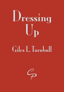
Having expressed that desire I must hold my hands up and admit to failing to add a cover description to my recently published pamphlet, Dressing Up, which is published by Cinnamon Press. That is mainly because I didn’t know the cover colour until the final proofs were being circulated and it totally slipped my mind; I will request that the brief description ‘the cover is red and has the title Dressing Up on two lines, with Dressing at the top of the cover and Up immediately beneath. Giles L. Turnbull is lower down on the cover. All text is in white font’ is mentioned alongside the introductory acknowledgements should it make it into a second print run.
To make up for this I recorded an audio version of a flyer that I’ll be sending out to let people know that Dressing Up is now in the Cinnamon shop. You can find the flyer on YouTube by searching for ‘Dressing Up audio flyer’. The picture in the video is that of the cover of Dressing Up and I do describe it in the video.

Can you tell us a bit about your experience of writing poetry inspired by artworks?
There is a Welsh organisation called Disability Arts Cymru and they hold a competition for disabled artists to challenge them to produce a piece of artwork that responds to a particular theme. The following year they hold a poetry competition where disabled poets respond to a piece of the submitted artwork or to the same theme, or both.
The first year I heard about this was 2015 which was the first year of the artwork competition and it did not have a theme. I wrote 2 poems, each responding to the respective painting’s title. The painting Blue Ballet Slippers by Rosie Moriarty-Simmonds resulted in Tomorrow’s Dancers, and Study in Red by Lucy Chaplin resulted in a poem of the same name from me. Ill health stumped my ability to submit my poems to the poetry competition, but Tomorrow’s Dancers is included in Dressing Up and is also part of an article I wrote about poetry and blindness for Poetry Wales summer 2016 issue. Study in Red features in another article about poetry and blindness I wrote for Irish magazine Corncrake also in 2016.
The next paintings competition theme was ‘ Austerity or Extravagance’ and again I picked two painting titles and used the main theme to respond to for the poetry competition. A Tree in Two Movements by Rose Foran led to a poem The Unfinished Story of a Tree in Two Movements, which had two stanzas, each one taking the subtitle of the equivalent movement of Schubert’s Symphony No.8 in B minor ‘The Unfinished’ so called because it only has the two movements where a symphony of that era would have had four; this poem was commended and will be included in the competition anthology. The second poem responded to Dressing Up Dressing Down by Gemma Paine and I titled it Glad Rags and I was again able to use it in my Dressing Up pamphlet; it will also be included in the competition anthology.
I like to respond to the title with initial ideas and then get a sighted person to describe the general look of the painting — whether it shows a scene or is abstract or patterned. Then in light of that description I go back to my poem and think about whether I can bring some of those elements into the choice of words or the structure of the poem.
With the painting Blue Ballet Slippers I was told that the painting showed a ballerina’s feet en pointe, so I brought more about the ballerina preparing for her future dances into my poem.
I did not have any visual input on what the Tree in Two Movements painting from the 2016 competition showed, but I immediately thought of Schubert’s Unfinished symphony, and when I read Rose Foran’s bio page I was delighted to discover she too likes classical music. So that guided the title and the structure of my poem and my mind paired that up with the idea of two different Christmas trees, one discarded after the festive season and the second one being a scavenged tree with improvised ornaments assembled by a homeless couple with their newly born child as a re-imagining of the nativity scene.
Your debut pamphlet Dressing Up has come out with Cinnamon this year – can you tell us what to expect?
I wrote the following as a blurb to promote my pamphlet:
Dressing Up presents scenes of life from getting ready in the morning to going out at night in heels and lipstick and a beautiful dress. Dressing up includes socks and that watch that may or may not be a Rolex. It embraces opera, the theatre stage and knights in front of castles. From the beauty to the self-harm, from job interviews to houses that have burned down. Put on your poetry glad rags and come and have a look at the world in its frailty and finery.
What’s next for you?
I aim to manage some readings to take Dressing Up out into a few places. Being blind means that travel usually depends on other people’s assistance, usually my parents, but I hope to manage half a dozen events. Two events are currently scheduled, one in Cardiff on 27 April and the other in Presteigne, Powys, and details about those will be posted on the Events page of my website, http://gilesturnbullpoet.com. Further events will be added as and when they are arranged.
Much like a band I’m now at the ‘difficult second album’ stage. I have two or three potential pamphlets taking shape, but I need to decide whether I want to keep them as self-contained pamphlets or to start to shape them into a first collection. I am very keen to work on a short story in verse that I have had gently simmering away for about twelve years and get it towards a final draft. It needs some harsh editing, deciding which chapters are fine with a bit of tidying up and which chapters are not as strong as they need to be and don’t really progress the story and therefore need to be killed. It’s definitely a labour of love.


